

AI Chatbots for Websites: A Guide for South African Businesses
September 24, 2026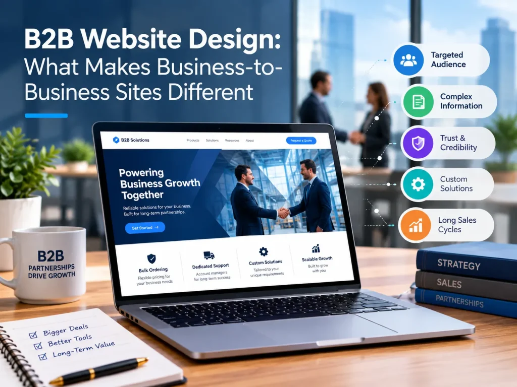
B2B Website Design: What Makes Business-to-Business Sites Different
A B2B website design is different from a B2C website because it supports a longer, group-based buying process where the goal is to earn trust and generate an enquiry, not to complete a sale on the spot. B2C sites usually push a quick purchase, while B2B sites need to answer detailed questions from several decision makers over weeks or months.
If you run a manufacturing company, a professional services firm or an industrial supply business in South Africa, this difference shapes almost every design decision you make. Here is how to structure a site that works for business buyers.
How B2B Website design buying behaviour differs from B2C
The easiest way to see the gap is to compare how each type of buyer behaves.
- Number of decision makers: B2C is usually one person. B2B often involves a technical evaluator, a finance approver and a senior sign-off.
- Length of decision: B2C can take minutes. B2B often takes weeks or months, especially for tenders and supplier onboarding.
- Type of purchase: B2C is often emotional or impulse driven. B2B is driven by cost, risk, compliance and reliability.
- Value of the transaction: B2C is usually low to mid value. B2B contracts are larger and often recurring.
- Information needed: B2C buyers want a quick overview. B2B buyers want specifications, certifications, references and pricing structures.
- Desired outcome on the site: B2C aims for a checkout. B2B aims for a quote request, a call or a downloaded document.
Picture a procurement manager at a Gauteng manufacturer looking for a new packaging supplier. They will not buy it after one visit. They will compare suppliers, share links with colleagues and check whether you look reliable enough to put forward internally. Your website has to support each of those steps.
Website goals for B2B: leads and trust, not immediate purchase
For most B2B companies, the site's job is to start a conversation with the right people. That means your main goals are usually:
- Generate qualified enquiries, such as quote requests and consultation bookings.
- Show that you are credible before anyone picks up the phone.
- Give buyers enough information to justify shortlisting you.
A B2B lead generation website therefore needs clear calls to action on every key page, forms that ask only for what you need, and content that filters out poor-fit visitors. Our guide to lead generation strategies covers how to turn these goals into a working system, and our article on turning website visitors into customers goes deeper on tactics.
A useful test: if a visitor lands on any page of your site, can they see the next step within a few seconds? If not, you are likely losing enquiries.
Structuring content for longer B2B decision cycles
A long buying cycle means people arrive at different levels of readiness. A site that only speaks to ready-to-buy visitors misses most of the audience.
Case studies and proof of results
Business buyers carry risk when they choose a supplier, so they look for evidence. Strong case studies do most of that work. Each one should cover:
- The client's industry and the problem they faced
- What you did and how long it took
- Measurable results, such as reduced lead times, lower costs or fewer errors
- A named contact or a short quote where the client agrees
For an industrial supplier, that could be a project showing how you kept a mine's maintenance schedule on track. For a professional services firm, it could be a client whose compliance workload dropped after switching to you. Client logos help too, and a dedicated page such as our clients gives buyers one place to check who you have worked with.
Content for different stages of the buying journey
Plan your B2B website content strategy around three stages:
- Awareness: Articles, guides and industry insights that answer early questions. A short piece on regulatory changes affecting your sector is a good example.
- Consideration: Service pages, comparison content, process explanations and case studies that show how you work and why you are different.
- Decision: Pricing guidance, quote request forms, technical spec sheets, certifications and clear contact details.
Content for decision makers should be written with their concerns in mind. A financial director wants to know about cost, risk and return. An operations manager wants to know about delivery, quality and support. Separate pages or sections for each concern make it easier for both to find answers. Our content marketing strategy guide explains how to plan and prioritise this material.
Email is also worth adding here. Not every visitor will enquire on the first visit, so a downloadable guide or newsletter signup, followed by email marketing, keeps you in front of buyers while they work through their internal process.
Navigation and information architecture for B2B sites
B2B sites often have more pages than B2C sites, so structure matters. Buyers should never have to guess where to find something.
A clear structure usually includes:
- Services or solutions: One page per core offering, with enough detail to answer technical questions.
- Industries or sectors: Pages for the sectors you serve, such as mining, manufacturing, logistics or financial services. If you serve several sectors, an industries page helps visitors see that you understand their world.
- About and team: Buyers want to know who is behind the company, including leadership and key credentials.
- Case studies or clients: Easy to reach from the main menu.
- Resources: A blog, guides, downloads and FAQs.
- Contact: A visible link and a call to action in the header.
Keep the main menu short, use plain labels instead of clever ones, and make sure every service page links to related proof and to a next step. Landing pages built for a specific campaign follow slightly different rules, and our guide to landing page design that converts explains how to build them.
Good structure also helps search visibility. Clear service pages, sensible internal links and relevant content give search engines context, which is why search engine optimisation and site architecture should be planned together.
Design choices that build credibility with business buyers
B2B design does not need to be flashy. It needs to look established, clear and dependable. A few choices make a real difference:
- Professional, consistent visuals. Use real photos of your team, facility or projects instead of generic stock images. A manufacturer's factory floor tells a stronger story than a handshake photo.
- Readable layout. Use short paragraphs, descriptive headings and enough white space so technical content is easy to scan.
- Visible trust signals. Show certifications, accreditations, industry memberships, B-BBEE status where relevant, and client logos near your calls to action.
- Fast, mobile-friendly pages. Many decision makers browse on their phones between meetings, and slow pages reflect poorly on your business.
- Accurate, current information. Outdated pricing, broken links or old team photos suggest a company that is not paying attention.
- Security and privacy basics. An SSL certificate, a clear privacy policy and careful handling of form data matter to buyers who share company information.
These details add up to trust. If you are planning a rebuild, working with a team that offers custom website design and development lets you shape structure, content and design around how your buyers actually decide.
Measuring B2B website design success beyond traffic numbers
Traffic alone says little about a B2B site. A page with 500 visits from the wrong audience is worth less than one with 50 visits from procurement managers who request quotes.
Better measures include:
- Enquiry volume and quality: How many form submissions, calls and consultation bookings you receive, and how many turn into real opportunities.
- Conversion rate by page: Which pages lead to enquiries and which lose visitors.
- Traffic source quality: Whether search, referrals, email or LinkedIn bring the visitors who actually enquire.
- Content engagement: Which case studies, guides or downloads are read most, and what visitors do afterwards.
- Sales feedback: Whether the leads are a good fit, and what prospects say they read before contacting you.
- Time to close: Whether content and site improvements shorten your sales cycle.
Set up conversion tracking from day one, and review the numbers monthly with your sales team. Proper data metrics and reporting turn guesses into decisions and show you where to improve first.
Final thoughts
B2B website design comes down to understanding a different kind of buyer. They take longer, involve more people and need more proof. A site that respects that, with clear structure, honest content and visible credibility, will generate better leads than one built to look impressive.
If you want help planning a B2B site that brings in qualified enquiries, get in touch with the Best Web Design team.